

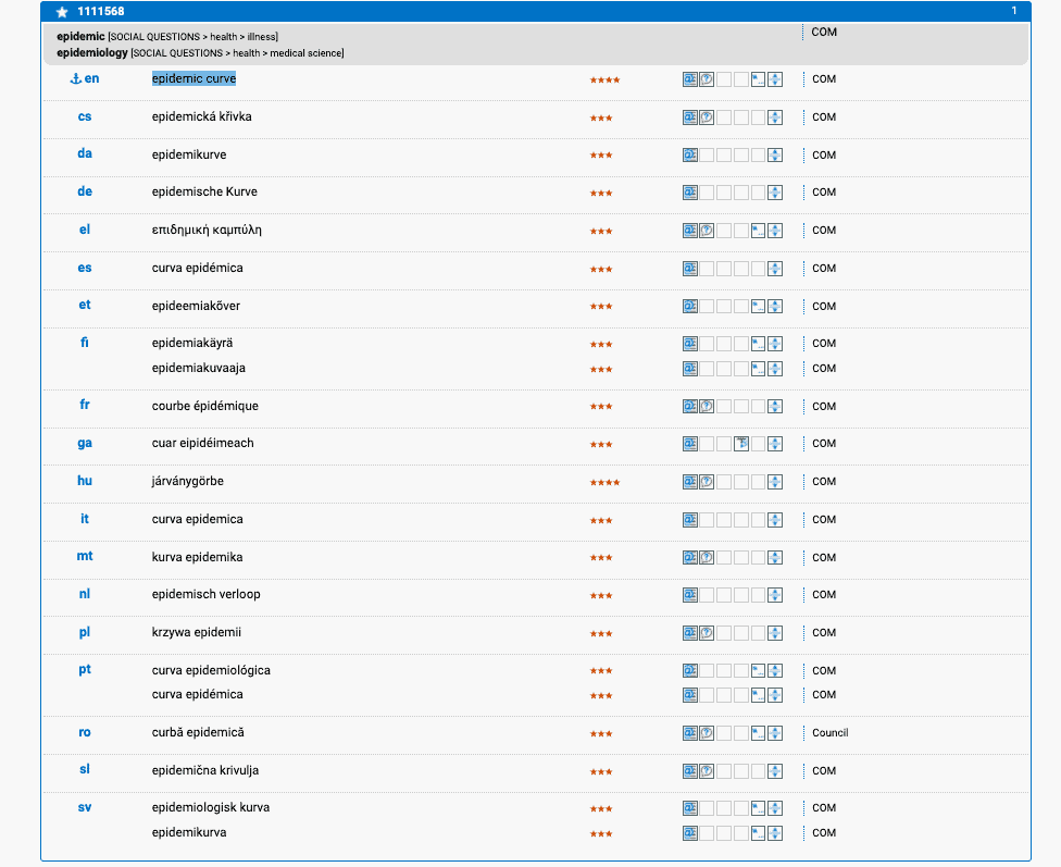
IATE defines the term ‘epidemic curve’, often shortened to ‘epi curve’, as a “curve that shows progression of cases in an outbreak over time”. An epidemic curve is a statistical chart that visually shows the onset and evolution of a disease outbreak. On an epidemic curve, the x-axis (horizontal line) represents the date of the onset of the disease. The y-axis (vertical line) represents the number of cases.
Looking at an epidemic curve can not only reveal how many cases there are over time. It can also show the timeframe(s) during which most people became infected, the severity of the outbreak, and the general trend of the outbreak. Outliers in an epidemic curve usually indicate the first cases of infection of the disease.

An epidemic curve can even tell us something about how a disease spreads. There are different types of outbreaks. In point source outbreaks, people are infected from the same source (e.g. they all attended the same event). In such cases, the epidemic curve rises sharply and falls gradually, with cases all occurring within one cycle of the disease’s incubation period.

In the case of a continuous common source outbreak, people are also infected from a singular source, but exposure to the source is prolonged and cases do not all occur within just one incubation period. For example, a contaminated water pump was the continuous common source of a major Cholera outbreak in London in 1854.

In the case of a propagated outbreak, there is no singular source and the disease spreads from person to person. The epidemic curve shows a number of progressively higher peaks, which are usually one incubation period apart.
While these are some text-book examples of epidemic curves, in real life, it is much more difficult to chart curves, since the exact number of cases can not always be reported accurately.
Below is the epidemic curve of the Covid-19 outbreak as of 16th June 2020. According to researchers Chen, Guo and Zhong, the Covid-19 outbreak started in December 2019 from a common source of contamination (a seafood market in Wuhan, China). These very first cases are shown in the curve on the left. After this, the disease spread from person to person, hence evolving into a propagated outbreak.

Flattening the curve
You have probably heard the phrase ‘flatten the curve’ more than a few times over the past few months. The curve in question is the Covid-19 epidemic curve. ‘Flattening the curve’ refers to slowing down the transmission of a disease, so that the cases are spread out wider. As a result, rather than having a number of high peaks (which indicate a high number of cases over a short period of time), a flattened epidemic curve will show that the cases are occurring over a longer period of time, instead of all at the same time.
One of the main reasons for flattening the curve is to avoid overloading the capacity of the healthcare system. In an unmitigated epidemic curve, the high number of people in need of medical attention may exceed healthcare capacities. As a result, the healthcare system is at risk of breaking down and people may not receive the medical attention they need. However, if the epidemic curve is flattened, there are fewer cases of ill people at a given point in time and the healthcare system is able to give each patient adequate treatment.

Many governments around the world have taken measures to flatten the epidemic curve of the Covid-19 pandemic, including enforcing quarantine, lockdown, and social and physical distancing.
Sources:
CDC. Using an Epi Curve to Determine Mode of Spread. Available at: https://www.cdc.gov/training/QuickLearns/epimode/ [Accessed 17/06/2020].
Chen, T., Guo, S., & Zhong, P. 2020. Epidemic characteristics of the COVID-19 outbreak in Tianjin, a well-developed city in China. American Journal of Infection Control.
ECDC. COVID-19 situation update worldwide, as of 16 June 2020. Available at: https://www.ecdc.europa.eu/en/geographical-distribution-2019-ncov-cases [Accessed 17/06/2020].
Outbreak Toolkit. Epidemic Curves. Available at: https://outbreaktools.ca/background/epidemic-curves/ [Accessed 17/06/2020].
Wayne W. LaMorte, MD, PhD, MPH. Boston University School of Public Health. Descriptive Epidemiology, Epidemic Curves. Available at: http://sphweb.bumc.bu.edu/otlt/MPH-Modules/EP/EP713_DescriptiveEpi/EP713_DescriptiveEpi3.html [Accessed 17/06/2020].
Wikipedia. Epidemic Curves. Available at: https://en.wikipedia.org/wiki/Epidemic_curve#cite_note-9 [Accessed 17/06/2020].
 Written by Janna Mack. From Luxembourg, she has degrees in Linguistics, Education, and Translation from Glasgow University.